Kintsugi Case Study
Project overview
The problem:
Busy professionals are interested in decorating their space with antiques, but do not have time to sort through items in person.
The goal:
To create an app that allows users to easily locate multiple antiques that are local to them, in real time.
The product:
Kintsugi is a mobile app used to find and purchase local antiques.
My role:
UX designer, UX researcher, Content strategist, and Visual designer
Responsibilities:
Conducting interviews, paper and digital wireframing, low and high fidelity prototyping, conducting usability studies, accounting for accessibility, and iterating on designs.
User research summary:
I conducted interviews and created empathy maps to understand the users I’m designing for, as well as their needs. A primary user group identified through research was working professionals who did not have time to shop for antiques in person.
This user group confirmed initial assumptions. Though research also revealed the antique shopping experience, as it exists currently, does not meet modern customer expectations. Beyond the amount of time spent, users also voiced the need to better categorize what’s available, and to have a product that is as user friendly as possible.
User Research - Pain Points
#1 Time
Working professionals have limited time to spend searching from shop to shop.
#2 Too Many Options
Choice paralysis can alienate people who are not familiar with antiques.
#3 Feeling Overwhelmed
Both new and old consumers can feel overwhelmed by the in person shopping experience.
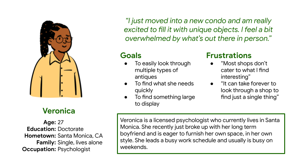
Persona 1 - Veronica
Veronica is a busy psychologist who needs to find a specific antique of size and style in order to fill their new space.
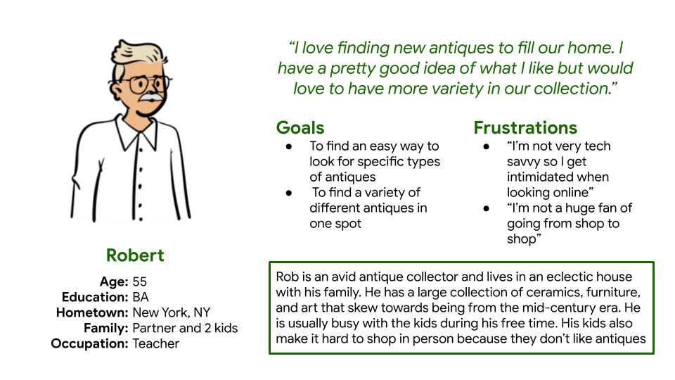
Persona 2 - Robert
Robert is an avid collector who has a and style in order to fill their new space.
User Journey Map
Veronica’s user journey map painted a picture of what was needed to best serve user’s like her.
Starting the Design
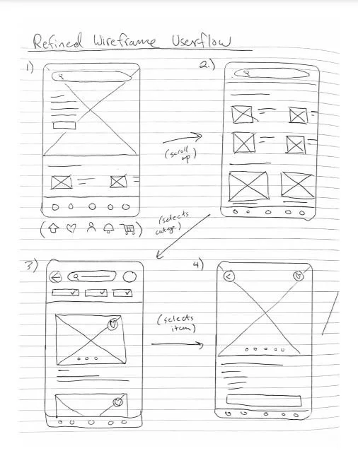
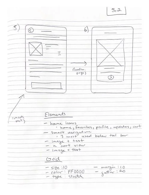
Paper Wireframes
These wireframes were used as a baseline to structure the app. From this process, multiple additions were added to best suit our user’s needs in app.
Digital Wireframes
Product Page
A detailed product page was essential to have users view items in efficiently, without missing details.
Product details are clearly listed with product images.
Search options were given high priority as well.
Favorites Page
A favorites section allows users to keep track of items they are considering in one convenient view.
Favorites are accessible from any point through the heart icon below.
Product Details Page
The product details page allows for even more information about a given item.
Additional product details are found here.
Liking an item from this page automatically adds it to the “Favorites” section.
Low-Fidelity Prototype
A low-fidelity prototype of the app has been tested and can be viewed below or by clicking here.
Usability Study Parameters
Study type:
Monitored usability study
Location:
Los Angeles, CA (remote)
Participants:
5 participants
Length:
~15 minutes
Study Details
Users were asked to interact with the app in various ways in addition to completing a purchase.
The five participants are a mix of various genders, socioeconomic backgrounds, ect.
Users were asked to interact with the app in various ways in addition to completing a purchase. The following research questions were then asked:
How long does it take to find a product that is added to cart?
How long does the checkout process take for a user?
Are users able to locate specific types of antiques that they have in mind?
How can we make the sale process as seamless as possible for the user?
Are there any changes that can be made to best facilitate the web store’s structure?
Is there any part of the web store that causes confusion for the user?
Usability Script
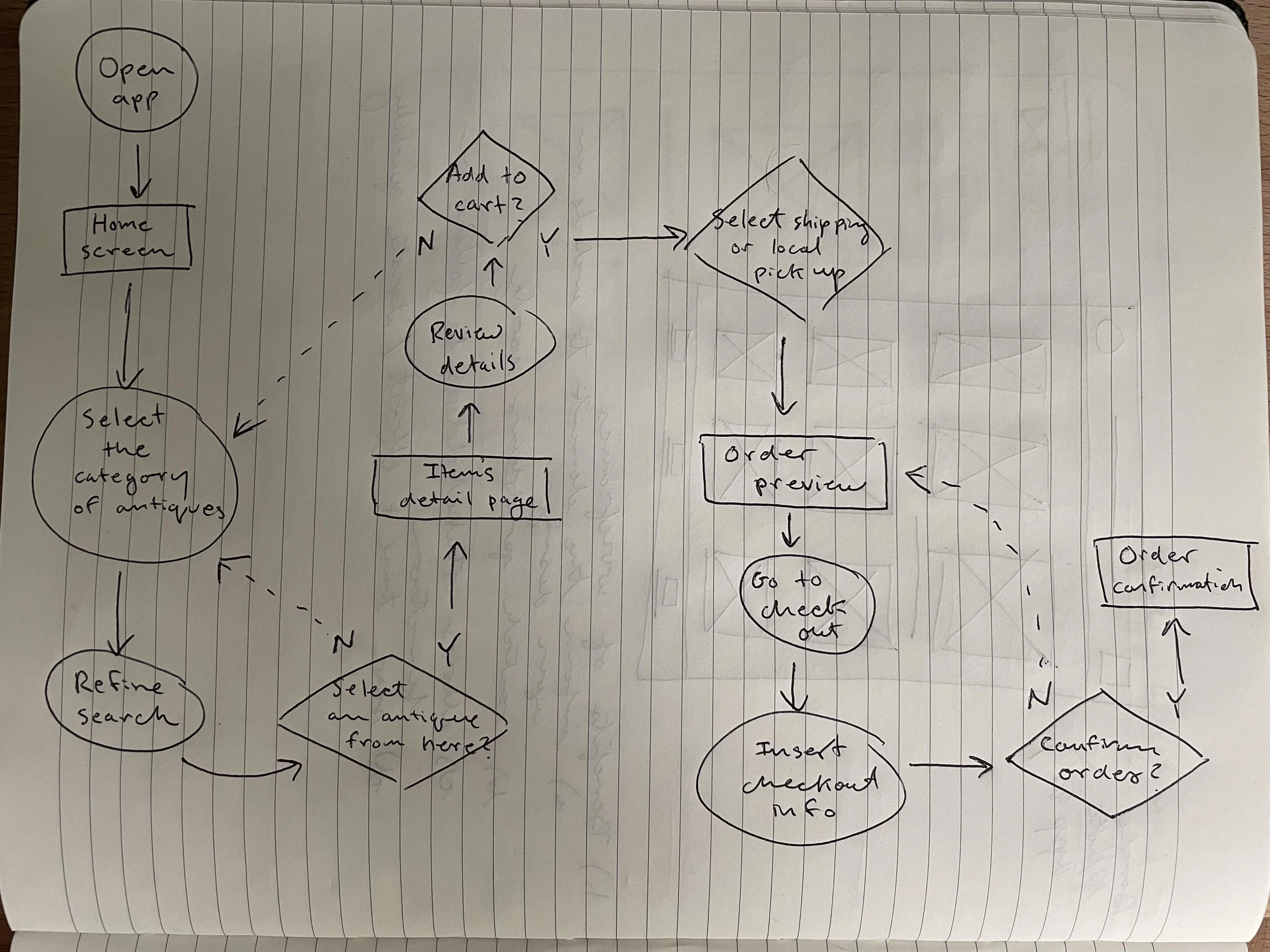
Prompt 1 : From the home screen, select a category of antiques
Prompt 1 Follow Up: How easy was this process and was there anything about it you would change to make it easier?
Prompt 2 : Favorite a particular antique that you wish to purchase later.
Prompt 2 Follow Up: Do you see yourself using this function to go back to antiques that caught your eye?
Prompt 3 : Add an antique to your cart and complete the checkout process
Prompt 3 Follow Up: How easy was this process and was there anything about it you would change to make it easier?
Prompt 4: Go to your profile menu page
Questionnaire to be completed at the end:
I would use this app frequently
I thought the app was overly complicated
The app was self explanatory
I thought each section of the app was there for a specific reason
I felt like as a whole, every section was well integrated
I feel like most people would be able to use the app without assistance from another person
I did not feel lost at any point during my use of the app
I felt like the app served a purpose outside of similar apps
I felt like the app saved me time in comparison to shopping in person
The checkout process worked in a way that made sense to me.
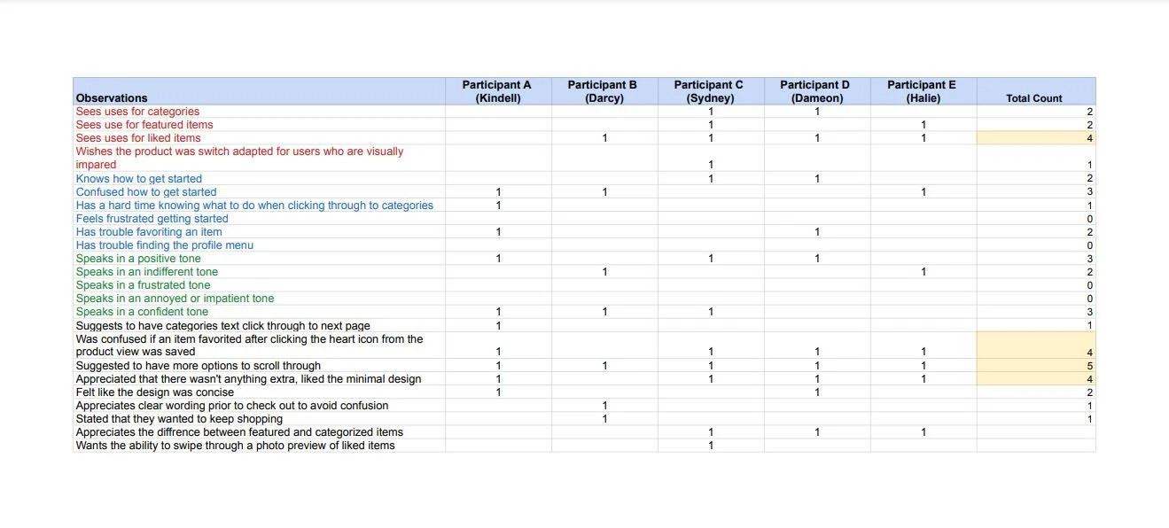
The notes shown were used during the usability finding. These notes were then used to categorize findings that drove insights about the usability of the app.
Usability Study Findings
Finding #1 - Users prefer ample scrolling options
Based on the theme that most users appreciate additional scrolling options, an insight is that scrolling is a high priority and should be implemented further in the app.
5 out of 5 participants voiced the desire to be able to scroll more frequently
Several users also stated that clicking was not as preferable with the current layout. Swiping was the preferred choice to make the interface smoother.
Finding #2 - Users value various category options
Based on the theme that clear categorization is appreciated, an insight is that liking and categorizing items allows users to easily find items quickly.
4 out of 5 participants appreciated the “Favorites” category within the app.
Users also stated that they appreciated the categories section, which features a preselected group of items.
Several users stated that numerous categories saves them time on searching for something in particular.
Finding #3 - Minimal Design
Based on the theme that minimal design was mentioned positively, an insight is that the majority of users steer towards minimal design characteristics for this given app.
4 out of 5 participants stated that the minimal design presented was preferred.
Users stated that too many elements can cause unneeded confusion when trying to navigate
Direct Quotes
“The ability to swipe through details within the same view instead of having to click in and out for more information, is really useful.”
— Sydney
“I use the favorite feature a lot in other apps, so this feature is nice. I am a window shopper"”
— Halie
“I use the favorite feature a lot in other apps, so this feature is nice. I am a window shopper.”
— Darcy
Mockups
From the usability study feedback, several changes were implemented that directly addressed my findings.
For example, with categorization being a key component in the study, the favorites section was fleshed out.
Additional App Mockups
Hi-Fidelity Prototype
A high-fidelity prototype of the app has been tested and can be viewed below or by clicking here.
Accessibility Considerations
The navigation flow was designed for users with multiple methods of accessibility
2.) High visibility and contrast were kept in mind while designing the typography and colors of the app.
3.) Icons were used liberally throughout the app for easier navigation.
Takeaways
Impact:
This product invites user’s to explore a new passion that may have been too intimidating to participate in otherwise.
One quote from peer feedback:
“If someone was looking for a specific type of item, it would be incredibly easy to find here!
What I learned:
Through the design of this product, user’s preferences guided each step of the process. The user’s feedback is key to building something that is fully suited to address their needs.
Next steps
Continue to run regular usability studies to make sure that users are having their pain points resolved.
Conduct additional research with a larger number of participants.
Expand on additional features in innovative ways.
Let’s connect!
I appreciate your interest in my work and for the time you spent exploring the case study above. If you’d like to see more or get in touch, my contact information is below.

