Rosehips Case Study
Project overview
The problem:
Most websites devoted to band merchandise have confusing designs, inefficient systems for browsing through merchandise, and confusing checkout processes.
The goal:
Design a merchandise site for a local band, named Rosehips, that was both user friendly and stylistically engaging. A clear navigation system to find merchandise and a quick checkout process were also a main priorities.
The product:
Rosehips is a responsive website used for a local Los Angeles bands merchandise.
My role:
UX design, conducting interviews, paper and digital wireframing, low and high fidelity prototyping, conducting usability studies, accounting for accessibility, and iterating on designs.
Responsibilities:
Conducting interviews, paper and digital wireframing, low and high fidelity prototyping, conducting usability studies, accounting for accessibility, and iterating on designs.
Understanding the user
User research summary:
I conducted user interviews, which I then turned into empathy maps to better understand the target user and their needs. I was then tasked with creating a website to help online shoppers find the type of merchandise they want in the sizes they want. Mainly, the focus is to see if the site is optimal for finding merchandise in a way that is intuitive and inviting. I also am hoping to pinpoint any specific challenges that users might face in the browsing, customizing, and placing an order.
User research : Pain points
Navigation
E-commerce websites, especially for merchandise, are often convoluted. Busy design can cause confusion with navigation and frustration for many users.
Interaction
Unclear prompts or buttons that do not indicate if something is added to your cart, can make the checkout process difficult.
Experience
Many online websites centered around merchandise do not provide an engaging experience from a purely visual perspective.
Persona : Chase
Problem Statement: Chase is a collector of musicians merchandise, who needs it to fit his own style, because he values his connection between the artist and their unique merchandise.
I created a user journey map of Chase’s experience using the site to help identify any additional pain points and improvement that might be implemented.
Starting the design
Sitemap
By using my empathy map and the persona I created, I was able to identify the main pain point of navigation issues. With that being known, I created a site map to strategically map out the overall website navigation.
Low-fidelity Wireframing
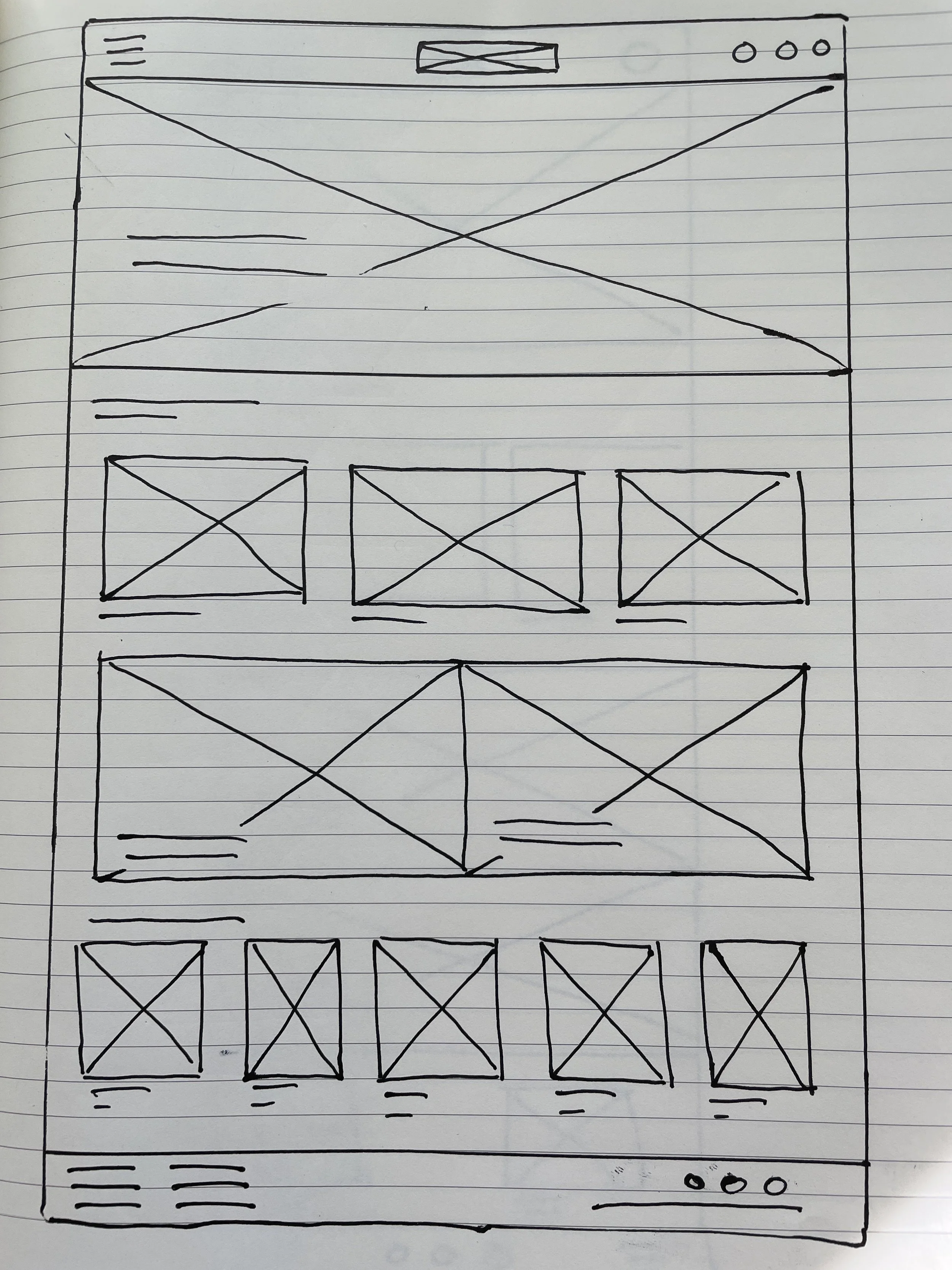
Keeping my user’s goals and pain points in mind, I began to sketch wireframes for each screen in my site. Once the paper wireframes, with their size variations added as well, I then moved on to translating my design digitally in Adobe XD.
Keeping useful buttons and key visual elements at easy access was key to addressing the previously outlined pain points.
The paper wireframe and digital, low-fidelity wireframe for my homepage can be seen below:
Low-fidelity Prototype
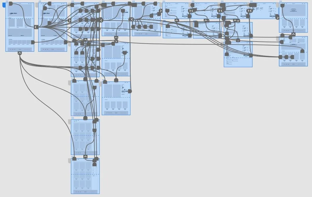
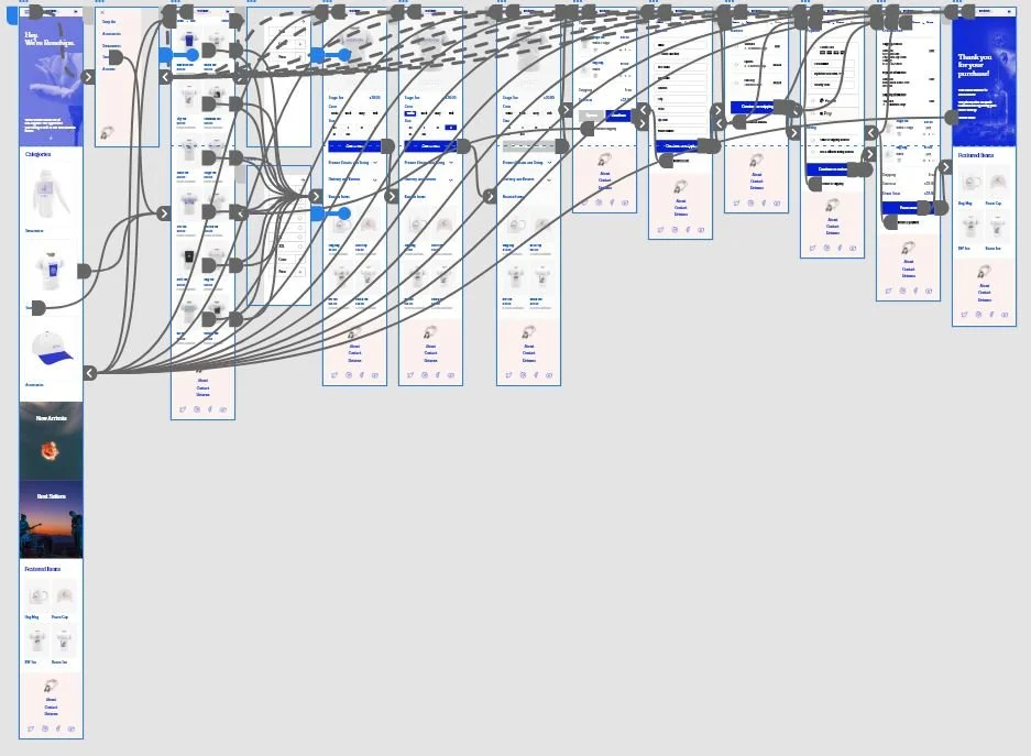
After all of the essential pages of my site were wireframed, I then connected them to create a low-fidelity prototype. The prototype displays the main user flow from the homescreen all the way to the point of confirming an order at checkout.
At this point in the design process, a usability study was formulated and conducted. The details of this study are provided below.
Usability Study
Usability Study Parameters
Study Type:
Unmoderated usability study
Location:
Los Angeles, CA (remote)
Participants:
5 participants
Length:
~ 20 minutes
Usability Study Findings
Options
It was observed that 3 out of 5 participants stated that they wanted additional clarity on the options they clicked or hovered over. This means that selected options need to be highlighted to a greater degree.
Checkout
It was observed that 2 out of 5 participants expressed interest in a 3rd party/express checkout option. This means that additional checkout options should be implemented.
Additional Navigation
It was observed that 5 out of 5 participants used a variety of selection options to locate their product. This means that additional options to navigate should be added.
Quantity
It was observed that 2 out of 5 participants wished to edit the quantity of their items from the cart. This means that a “-” and “+” icon at the cart item should be implemented.
Refining the design
Mockups
Based on the usability findings, I modified my designs to improve the main user flow. From the images below, the checkout page now allows for multiple forms of payment, in addition to being able to modify the item quantity in cart.
Before usability study
After usability study
Mockups: Original screen size
In addition to creating high fidelity mockups for all of my pages, I created accommodating mockups for mobile browsing. The majority of users expressed their desire to shop on mobile, so creating variations for mobile devices was essential to meet the user’s needs.
Additional desktop mockup
Mobile browsing mock up example
In addition to my mockups, over 17 original products were created and 3D modeled for the Rosehips website.


High-fidelity Prototype
Accessibility Considerations
) Landmarks were used to help with navigating through the site
2.) Headings with clear typographical hierarchy were used throughout the site.
Takeaways
Impact:
The impact of this project showed that with clear, consistent design a product is at it’s best. A clear visual hierarchy allows users to locate what they need quickly and to prevent any possible cart abandonment.
What I learned:
My takeaway was just how much the seemingly small details matter. The focus should always be on the user and to make sure these small details are given the priority that they deserve.
Next steps
Ideate on new features or products that could be implemented in a unique or engaging way for the user.
Conduct a follow up usability study to see if any further improvements can be made to meet the user’s needs.
Implement AR/VR try on for certain products.
Let’s connect!
I appreciate your interest in my work and for the time you spent exploring the case study above. If you’d like to see more or get in touch, my contact information is below.


